Antonio Vivaldi’s Le Quattro Stagioni (The Four Seasons) is one of the most famous classical works ever written. There are countless recordings of it available, and all virtuoso violinists have its four concertos in their repertoire. So celebrated, beloved and venerated are these works that any tinkering with their musical substance is instantly detected and seen as a crime against Vivaldi’s genius – in our collective musical memory, every note in these scores is sacred. It was therefore inevitable that Max Richter would come under the spotlight when he took on the challenge of reimagining this set of twelve movements, releasing his album under the title Recomposed by Max Richter – Vivaldi · The Four Seasons.
Richter’s version of the work, in which 75% of the material is new, consists of layers of sound recorded with both acoustic and electronic instruments, and presents the original material in phased and looped musical cells. Its extremely contemporary form reflects his interest in minimalist and postmodern music, but his interpretation is unquestionably a sincere tribute to the original. Its rapid spread into popular culture (e.g. its use in film soundtracks) suggests that Richter’s work not only tapped into the Zeitgeist but went on to help shape it.
Recomposed was brought brilliantly to life by the Konzerthaus Kammerorchester Berlin, conductor André de Ridder and soloist Daniel Hope. The market’s response to the album was positive, though perhaps not overwhelmingly so. The cover may have played a part here – the original 2012 design features a collage of pages from the score covered with Richter’s annotations and topped off by the well-known yellow cartouche.
While it gave a nice insight into the (re)composer’s working practices, the design wasn’t particularly innovative or eye-catching. Discussions soon began about updating it, not least with a view to reaching a younger audience who weren’t necessarily familiar with musical notation and so hadn’t connected with the original cover. In search of a fresh and radical approach (which is what was needed here), DG could have commissioned someone entirely unconnected with the album, but they decided instead to go back to the same designers – Berlin-based agency Double Standards. Second time round, using their in-depth knowledge of the project, its team came up with an entirely different design solution, one that proved to be a major success.
Its cover features twelve narrow yellow vertical bars on a plain grey background, representing the twelve movements in The Four Seasons, and, of course, the twelve months of the year. Cut-out slits in the front of the cardboard pocket (into which the booklet slides from the right-hand side) allow glimpses of the booklet cover. Only as the booklet is removed from its pocket is a four-colour design reflecting the four concertos revealed. The colours can be read as symbolising the seasons – green for fresh spring leaves, yellow for the summer sun, red for autumn leaves and blue for the ice of winter. And as soon as you start to remove the booklet, they change, visible for a fraction of a second as they pass beneath the cut-outs in the digipak cover. You can see the striking results in this exclusive video, sent by DG’s creative team to Max Richter for him to approve the mock-up design.
The effect is similar to that of a flip-book or zoetrope, with stroboscopic images giving the illusion of motion. The same design, which echoes the layering techniques used by Richter in his music, was used on the cover of the vinyl version. In production terms, matching the front cover of the booklet with the slits in the digipak or LP gatefold so that the yellow bars, which are only a few millimetres wide, would lie precisely beneath them when the booklet was fully inserted, was a major challenge. The slightest inaccuracy would ruin the effect. Creative Manager Oliver Kreyssig’s meticulous coordination between the designers and the printers, however, together with the care taken in assembling the individual parts, right through to shrink-wrapping, ensured that each copy was perfect when it reached the buyer, even on a large print run.
The jewel case version, on the other hand, shows the four colour-coded seasonal blocks, each divided into three months/movements.
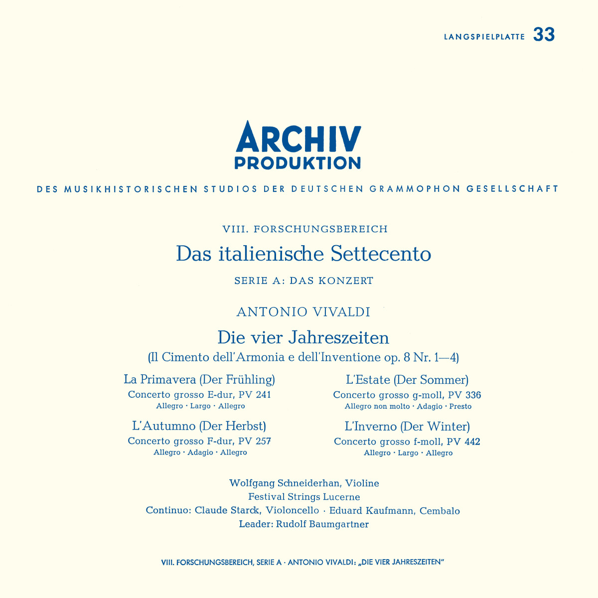
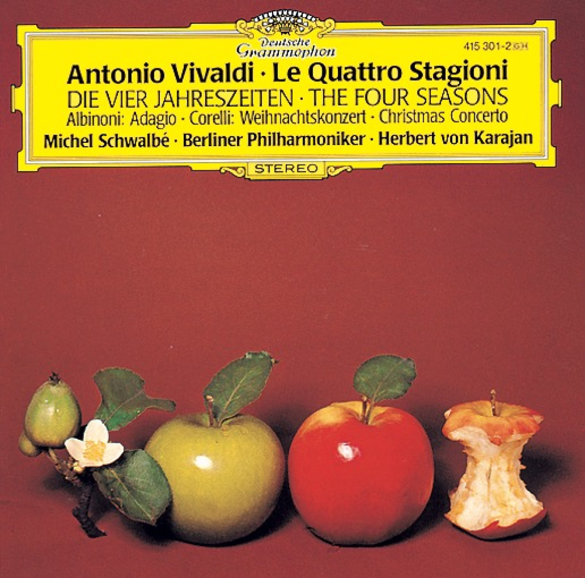
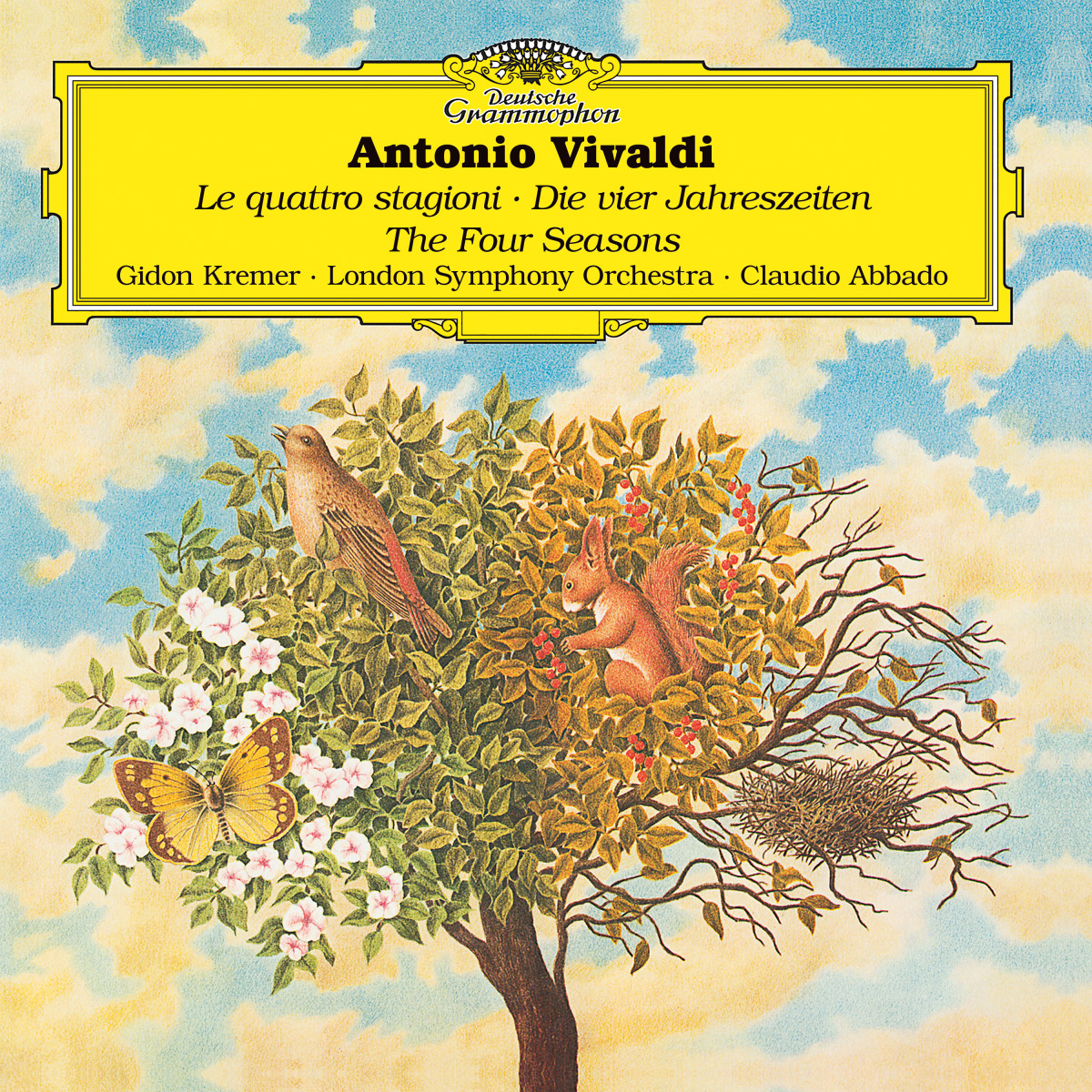
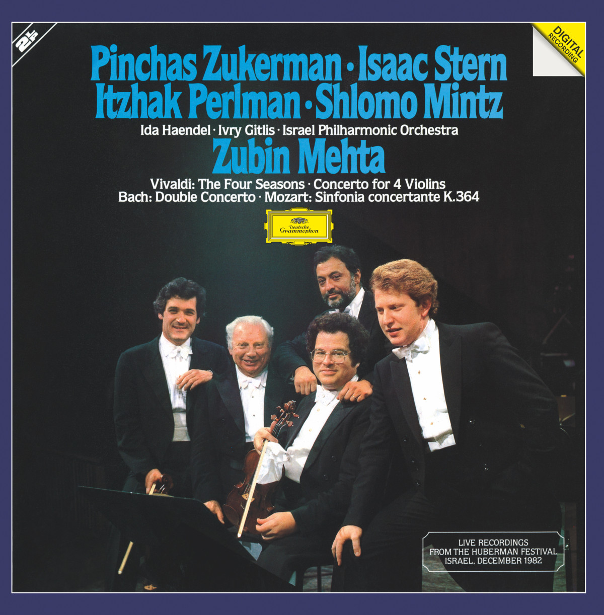
Max Richter’s The Four Seasons joined a pantheon of hit DG versions of Le Quattro Stagioni, and it’s worth recalling some of its legendary predecessors – recordings which have gone down in musical history not only because they feature exceptional artists, but also thanks to their tailored cover designs. Each recording has its own significance, its own fan base, and its own visual identity:
The cover of Trevor Pinnock’s Vivaldi interpretations with The English Concert and soloist Simon Standage offers a very good example of this individualised approach. The principal appeal of its rather understated and elegant classical design lies in the enigmatic male figure depicted in the circular space at the centre.
His appearance is that of a mythical creature, with his muscular torso, puffed-out cheeks and extravagantly billowing locks. He is in fact Aeolus, ruler of the winds in Greek mythology, as portrayed in an early Renaissance manuscript. The illuminated inital letter of a chorale is by Liberale da Verona; this choir book was created in 1470-74 for Siena Cathedral’s Piccolomini Library.
Whoever selected this miniature, perhaps familiar primarily to art historians, for the cover of Le Quattro Stagioni, must have been aware of the traditional cultural analogy between the four seasons and the four winds (associated with the points of the compass). So we are looking at an erudite, but also highly decorative form of visual shorthand.
Going back to Max Richter – a decade after its release, he revisited his homage to Vivaldi. This time his recording partners were soloist Elena Urioste and the Chineke! Orchestra, which is made up of Black and ethnically diverse young musicians. He asked the young players to use gut strings in order to create a different aural impression, bringing his 21st-century composition closer to the sound Vivaldi’s contemporaries would have heard.
To match Richter’s fresh approach, DG wanted a cover design for The New Four Seasons that would retain the essence of its predecessor but bring something new to it as well. London-based agency Farrow took their lead from the previous four-colour scheme, but chose a more subdued palette that also included a range of subtle intermediate tones. The changing gradations in colour echo the length of the individual movements. Conceptually, the design offers a series of diametric contrasts to the 2012 version. Instead of vertical dominance we have horizontal banding. Blurred transitions replace individual strips of colour. The bright colours of 2012 make way for the muted tones of 2022. All in all, this is a finely-nuanced and sophisticated homage to a homage!