Mozart: Die Zauberflöte, K. 620
Release:


On 10 March 2023, DG’s Customer Service department received an enquiry via email: “In the 1960s, Ignaz Breitkreuz (1925-1991) designed record covers for Deutsche Grammophon and Heliodor. I should like to know whether you hold lists of his LP and single covers, and whether you have the originals and associated information in your archives.”
The man behind this precisely worded request was the artist’s son Christoph Breitkreuz, a geologist specialising in research into the ancient soil strata dating back millions of years that are found in volcanic areas. In other words, he is a kind of “lava archaeologist”, and the author of scientific papers with such impressive titles as “U–Pb zircon geochronology of the Ediacaran volcano-sedimentary succession of the NE Saghro inlier (Anti-Atlas, Morocco): Chronostratigraphic correlation on the northwestern margin of Gondwana”. Having recently retired, Christoph, together with his brother Felix, had decided to document their father’s life’s work.
One of the first things Christoph Breitkreuz did was to write the email quoted above. His timing was perfect, because research into The DG Cover Stories had just begun at the start of the year – what a stroke of luck for us!
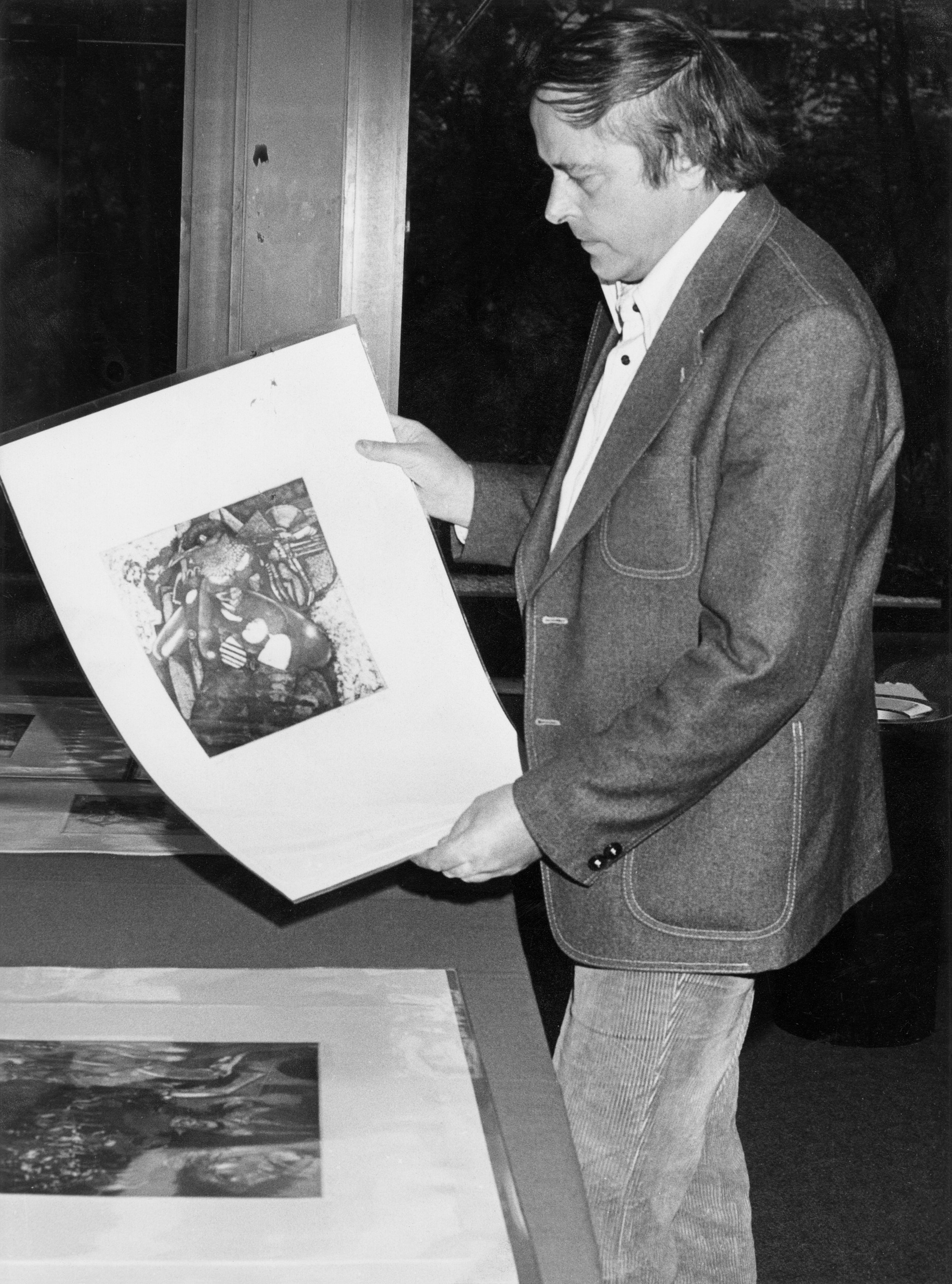
© Horst Breitkreuz - © Estate of Horst Breitkreuz
I spoke to him on the phone the very same day, and this led to a lively exchange of information and images. In the end, I was invited to examine Horst Breitkreuz’s artistic estate at the family home in Berlin.
The opportunity to see his original works – and the lively conversations we had that afternoon – yielded many insights and leads for research into both the artist himself and his designs for Deutsche Grammophon’s album covers. Shortly afterwards, the family published a German-language Wikipedia article outlining the facts they have been able to glean so far about the life and work of Horst Breitkreuz.
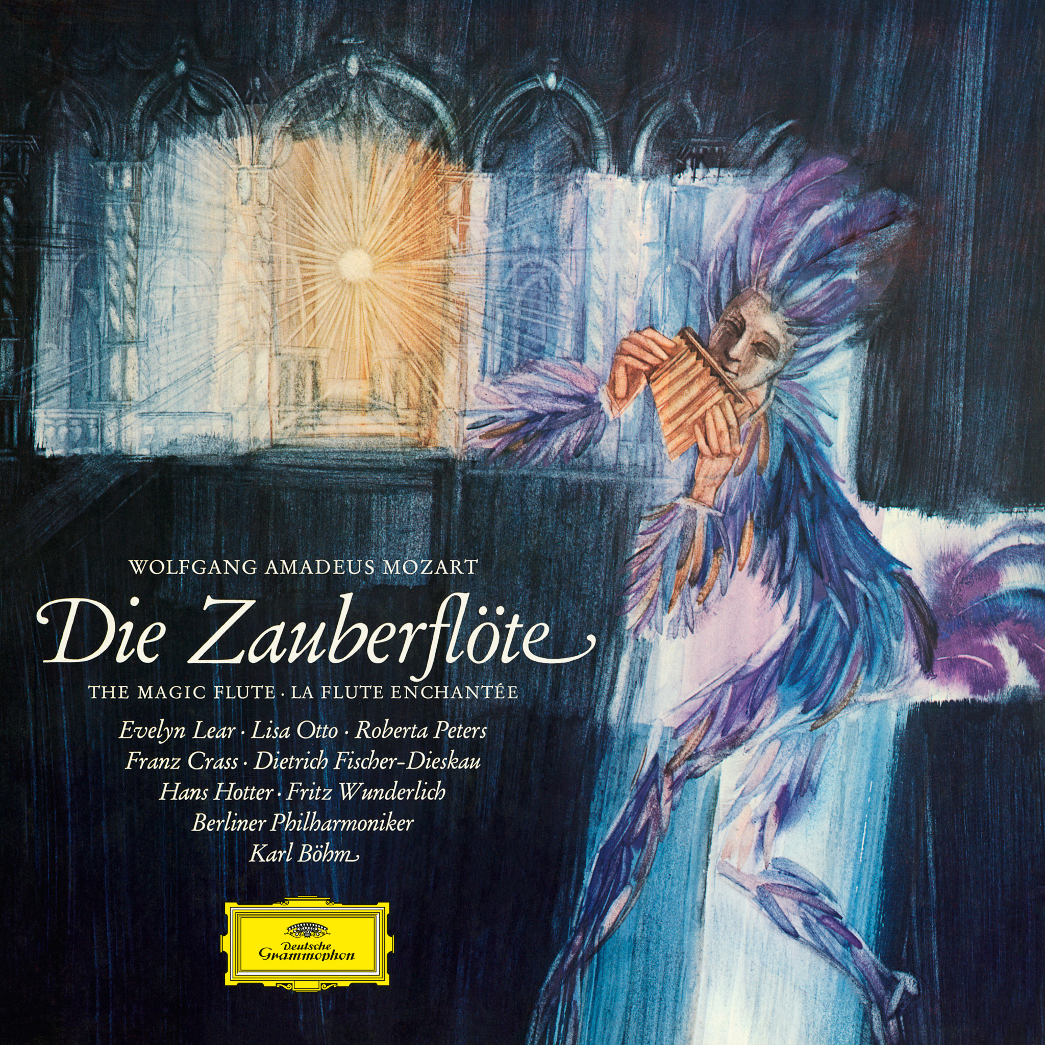
The artist’s name itself was the subject of considerable debate. On the record sleeves he was credited as both Ignaz H. Breitkreuz and Horst Breitkreuz. As far as we can see at the moment, his decision to add Ignaz to his usual first name of Horst is only attested by one DG cover, though this does happen to be the best-known of his designs for the label – the illustration for Karl Böhm’s 1965 recording of Die Zauberflöte (The Magic Flute) with the Berliner Philharmoniker and an illustrious line-up of soloists.
Christoph Breitkreuz has clear recollections of the careful preparation his father put into every DG commission. The artist owned numerous reference works on cultural and art history, as well as illustrated volumes on period costume, which he used as a source of inspiration and to provide a solid basis for his designs. A number of details show how meticulously Breitkreuz had researched the history and plot of Die Zauberflöte when creating this cover illustration. In the background is an architectural fantasy with an arcaded frontage – doubtless the temple in which most of the action takes place. The sun radiates light from within. This relates directly to Sarastro’s closing aria, where he sings: “Die Strahlen der Sonne vertreiben die Nacht…” (“The rays of the sun dispel the night, destroying the hypocrites’ fraudulent power”). In the foreground we have Papageno, whose costume reflects a fundamental design element that can be traced back to the opera’s earliest days. Emanuel Schikaneder, manager of Vienna’s Freihaustheater and the singer who created the role of Papageno, wore a garment entirely covered in birds’ feathers at the premiere in 1791.
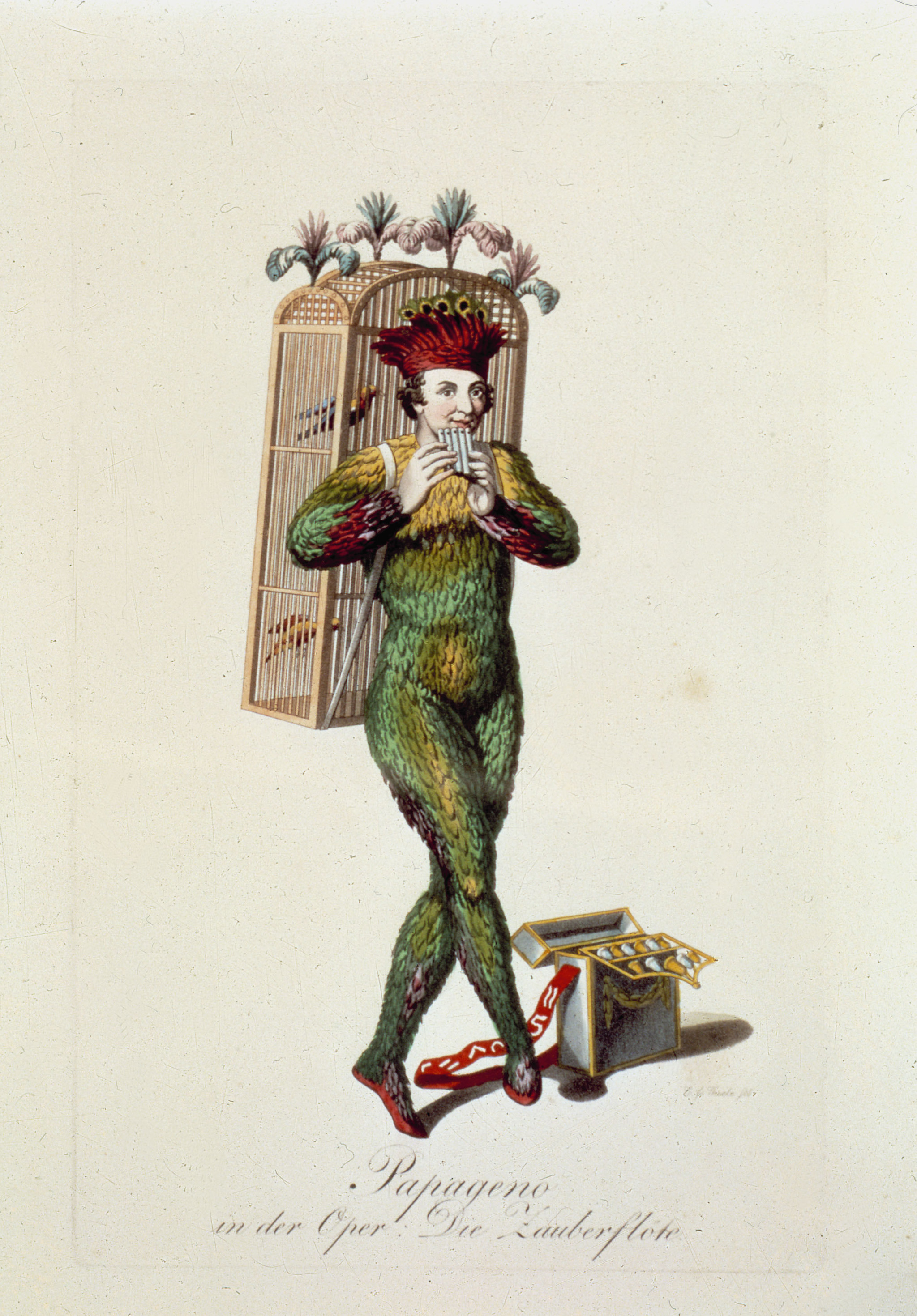
© Karl Friedrich Thiele: Papageno, 1816, Royal Court Opera, Berlin. © akg-images
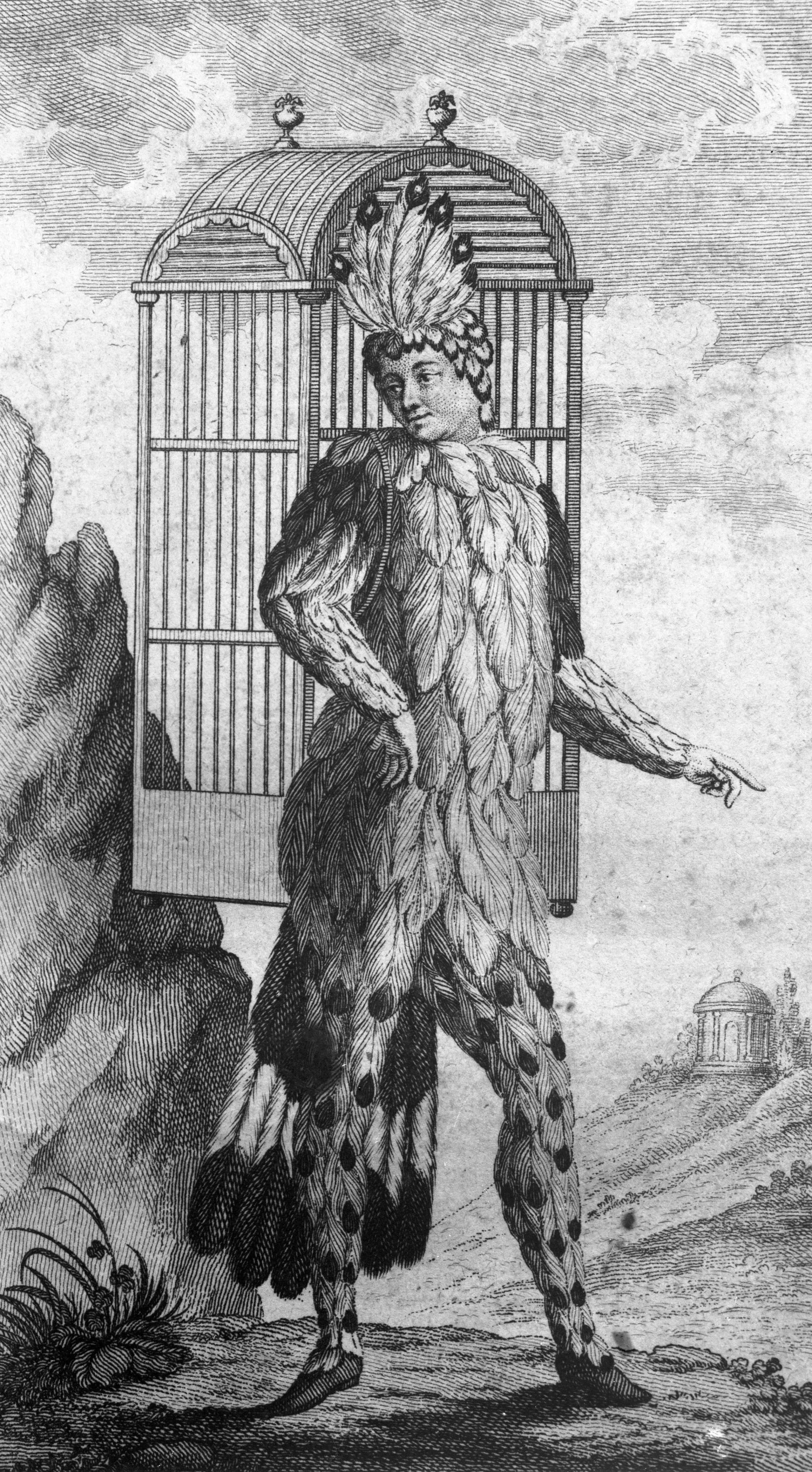
© Emanuel Schikaneder as Papageno, 1791, Freihaustheater, Vienna. © akg-images / ÖNB-Bildarchiv / picturedesk.com
Breitkreuz depicts him in a very similar way, adding a bird catcher’s flute resembling a set of panpipes – the style we know Papageno had for a performance at the Royal Court Opera in Berlin in 1816.
Among the artist’s papers is a sketch of the figure of Papageno. Executed in gouache technique, it gives us an insight into Horst Breitkreuz’s creative process.
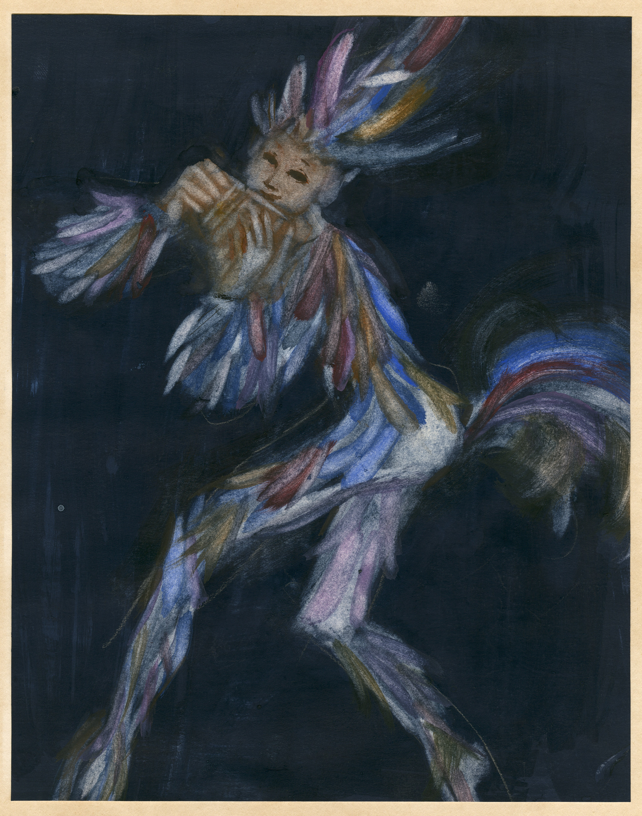
© Horst Breitkreuz: Sketch for Papageno, 1965. © Estate of Horst Breitkreuz
If we compare the sketch with the final cover design, we can see that he has carried the general concept of the figure across, especially the dance-like pose and the feathered garment, but has refined the detail, reducing and lightening the colour palette, thus making it more harmonious. The face has been stylised so that it more closely resembles a theatrical mask. The artist has also set the figure of Papageno against the architectural background, as though isolating him from the action and zooming in on him – an effect we’re familiar with from comic books, for example.
A selection of the other covers designed for Deutsche Grammophon by Horst Breitkreuz demonstrate his versatility.
Breitkreuz had a major impact on the look of many albums released by Deutsche Grammophon during the 1960s. He is known to have produced at least 24 published cover designs for DG between 1961 and 1969, as well as a further 10 for its sister label Heliodor. His unique style, characterised by lightness of form and fluidity of colour application, enriched the visual identity of the Yellow Label for almost a decade, translating the listening experience into a poetic visual language. It is good to know that his family is committed to preserving and providing access to his artistic legacy.